Home Office Design
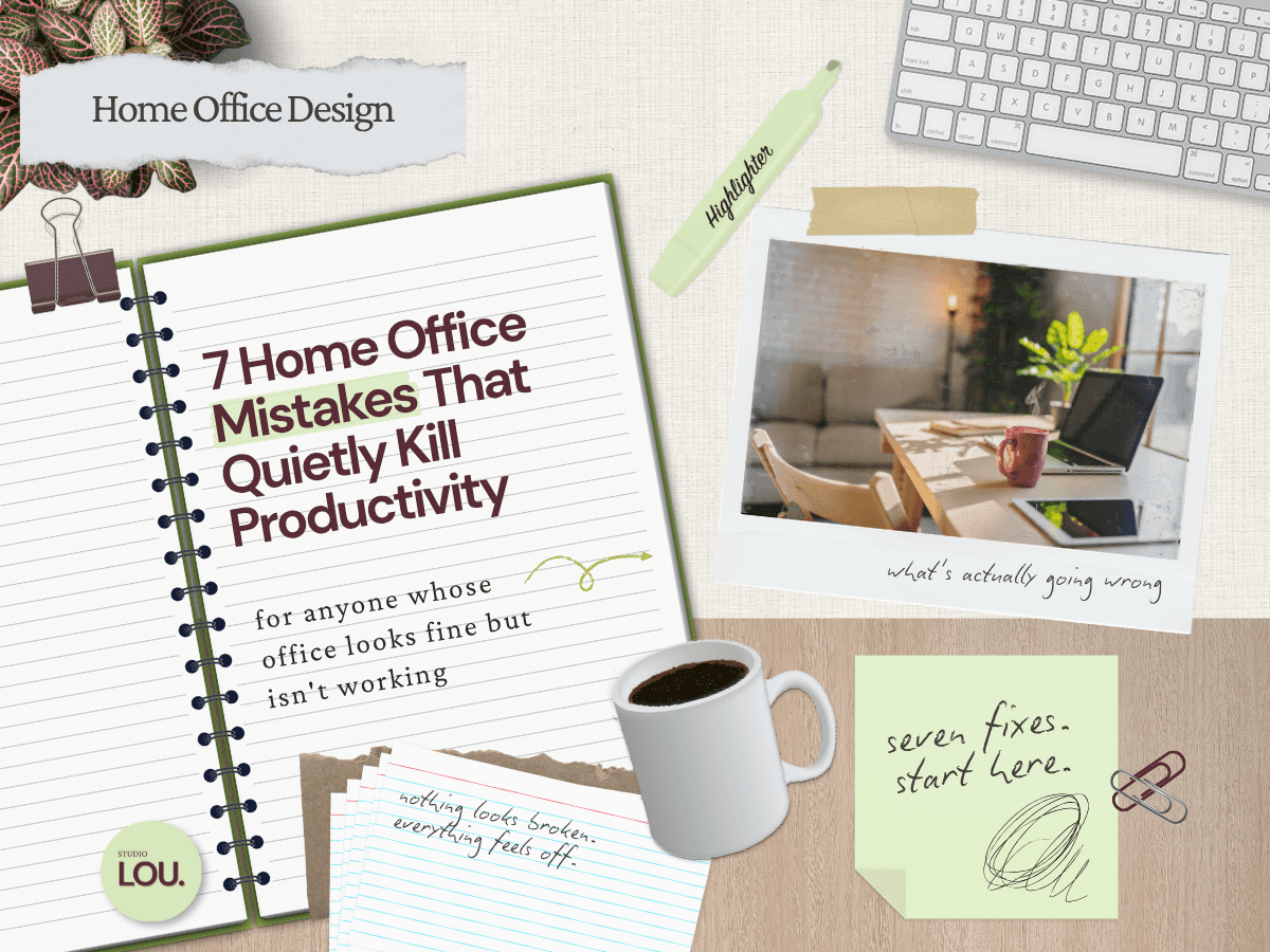
7 Home Office Mistakes That Quietly Kill Productivity (and How a Designer Fixes Each)
7 Home Office Mistakes That Quietly Kill Productivity (and How a Designer Fixes Each)
At A Glance | |
|---|---|
Why Home Offices Quietly Fail | Designing Around the Wrong Thing |
Treating It Like an Office, Not a Home | Skimping on Home Office Lighting |
Ignoring Sound and Acoustics | Underestimating Storage |
The Undesigned Camera Background | Putting Your Desk in the Wrong Spot |
Why Home Offices Quietly Fail
I have spent the last month writing about how to design a home office well, for shared households, for startup remote workers, for creative professionals. But most home offices do not fail because someone missed a good idea. They fail because of a handful of mistakes almost everyone makes, the kind that do not announce themselves. Nothing looks broken. The room photographs fine. You just notice, six months in, that you are tired by 2pm, your calls sound worse than your coworkers', and you can never quite find anything.
I have made several of these myself. A few of which I lived through across two apartments with my boyfriend, both of us working from home in the same room with completely different jobs and schedules. The rest I see constantly in client work. That dual-worker setup taught me something most home office advice skips: some of these mistakes are survivable when one person works in a room, and quietly miserable when two people do. Storage, sound, and desk placement all change shape the moment a second person and a second set of calls enter the space.
This is the post that closes the loop. Seven mistakes, the ones I see most, each with the fix. Most cost little or nothing to correct. They are about seeing the room clearly, which is the hardest thing to do in a space you sit in every day.
Mistake 1: Designing Around the Wrong Thing (the Photo or the Gear)
Most home office mistakes start before anything gets bought, in what you design the room around. Two approaches go wrong, and they tend to belong to two different kinds of people, which is exactly why they collide in a shared office.
The first is designing around an image. You find a setup you love on Pinterest or in a catalogue and build toward it, but those rooms were styled to sell a photo, not to be worked in. The matching desks, the styled shelf with three books and a vase where storage should be, the laptop alone on a clean surface: those are choices made for the camera. Copy the image faithfully and you inherit a room optimized for an image instead of for your work.
The second is designing around the gear. The instinct is understandable, because gear and workflow really are inseparable. But that is the trap. It slides into gear overload: the second mechanical keyboard, the third monitor angled where it strains your neck, the KVM switch that turns a quick device swap into a messier one, the oversized headphones for the video games you never have time to play. More equipment starts to feel like more productivity, when past a point it just crowds the surface, the cables, and the room.
In a two-worker household these instincts often belong to one person or the other. One of you shops by how it looks, the other by what it does, and the room absorbs the cost of both.
The fix for both is an order of operations. Start with how you actually use the space and what the room allows: the square footage, the window, the door, the walls. Then add what you genuinely need to do the work, gear included, nothing more. Then decide how you want it to look. Function does not come from the image or the gear pile. It comes from designing for how you work, inside the room you actually have.
Mistake 2: Treating Your Home Office Like an Office, Not a Home
Somewhere along the way, "home office" got read as "office, at home," and people build the corporate version: cold overhead light, gray laminate desk, a cubicle chair, bare walls meant to minimize distraction. It looks like work, so it feels like it should produce work. It does the opposite. You are in this room 40 or more hours a week, and unlike a corporate office, you live in the home around it. A space that fights the rest of your house is one you will quietly come to avoid.
The research is decisive. In studies out of the University of Exeter, people working in enriched spaces with art and plants were 17 percent more productive than those in stripped-down "lean" offices, and the ones who personalized the space themselves were 32 percent more efficient. The irony is that the corporate world already knows this. Walk into a well-designed office in 2026 and you will find warm wood, soft textures, and plants treated as a new neutral. The look people import into their homes is the one real offices are spending money to design their way out of.
This compounds in a shared office. When two people split a room, the safe move feels like neutrality, a beige truce that offends no one. But the Exeter finding is specifically that personalization drives the gain. A room designed by committee to please both of you equally is personalized by neither of you, and it underperforms for exactly that reason.
The fix is to design it as a room in your home first and a workspace second: warm materials, a residential lighting layer instead of one cold ceiling fixture, a chair that earns its ergonomics without looking like a call center, art you actually like. In a shared space, give each person a genuinely personal zone and unify through the bones of the room, not a sanded-down compromise.
Mistake 3: Skimping on Home Office Lighting
Lighting is the most common under-investment in a home office, usually one overhead fixture doing the entire job, casting the same flat light on a 9am call and a 4pm focus block. That is not lighting a workspace, it is illuminating a room.
Good task lighting works in layers: an ambient layer for the room, a task layer where the work happens, and enough control to shift between them as the day changes. The single overhead bulb cannot adapt. It lights the back of your head while your desk sits in shadow, flattens everything on camera, and leaves you no way to brighten the surface for focus or warm the room down at night.
Then there is color, which matters enormously if any part of your work is visual. Color accuracy is measured by CRI, the color rendering index, on a scale to 100. The bulbs sold at most hardware stores sit around CRI 80, which renders deep reds, skin tones, and wood tones subtly wrong, so the color you approve at your desk is not the color your client sees. The jump from CRI 80 to 90 is the one your eye actually notices, and 95 and up is the tier for serious visual work.
A single shared light cannot solve any of this. In a two-worker office you each peak at different hours and do different work, so one ceiling fixture serves neither of you well. The fix is per-desk task lighting so each person controls their own pool of light, a shared ambient layer for the room, and high-CRI bulbs (90+, or 95+ for visual work) wherever real work happens. I go deeper in our guide to home office lighting that actually boosts productivity, but the short version: three light sources minimum, and never let the ceiling do the job alone.
Mistake 4: Ignoring Sound and Acoustics
Sound is the mistake people cannot see, so they never diagnose it. You sound slightly worse on every call than you should, a little hollow, and you blame your microphone. Often it is the room. A space with hard floors, bare walls, and little soft material is an echo chamber: hard surfaces reflect sound, soft surfaces absorb it. Square-ish rooms with parallel bare walls are the worst offenders, because sound bounces between them and builds up in the corners.
It is worth separating two things people mix up. This is acoustic treatment, softening how the room sounds inside it, not soundproofing, which blocks sound from passing between rooms. You do not need a studio buildout. In a square room the corners are the highest-leverage spots, because that is where sound energy collects, and you do not have to mount a bass trap to address it. A tall plant, an upholstered chair, a leaning piece of art, or a bookshelf tucked into a corner all break up that buildup while looking like design rather than equipment.
In a shared office the problem doubles. It is not only that your calls sound bad, it is that your officemate's call becomes the soundtrack to your focus block. Soft surfaces help both of you: a real rug, curtains instead of blinds, one upholstered piece, corners softened. But be realistic about the limit. Treatment makes a room sound better; it does not make a live human three feet away inaudible. If both of you take calls from the same room, a good pair of noise-blocking headphones is not optional. You do not need to overspend: the Anker Soundcore Space Q45 is a strong, well-reviewed pick around $100, and Sony's WH-1000XM5 is the step up when it goes on sale.
Mistake 5: Underestimating Storage in a Shared Home Office
Storage is the mistake that does not show up on day one. A new office always looks like it has enough, because you have not accumulated yet. Then the months pass, the files and supplies and chargers and "I'll deal with this later" pile builds, and you find yourself working off a cluttered surface in a room that felt spacious in January. The standard advice to "declutter" misses the point. The problem is rarely that you have too much. It is that you planned for less than you were always going to have.
The rule I use is simple: plan for one and a half times the storage you think you need. Real working life generates more than the tidy version in your head, the second monitor box you kept, the cables you might need, the paperwork you cannot shred yet. Build for the work that actually happens, not the work as it photographs.
In a shared office the math does not just double, it overshoots two. I think of it as the storage tax: two workers need closer to two and a half times the storage, not twice. Each person brings their own files, supplies, and tech, and then a third category appears that a solo office never has, the shared stuff. The second printer. The redundant chargers neither of you will throw out. The "we both use this" pile that belongs to no one and lives everywhere.
There is also a placement layer that matters more with two people. Each person needs accessible storage, the things they reach for daily, within arm's reach of their own desk, and what counts as daily is rarely the same for both of you. One of you lives in physical files and needs a drawer at the desk; the other works almost entirely on screen and would rather use that space for a sketchpad and swatches. Plan each person's close-in storage around their own work, then push the shared and seldom-used things to the room's general storage. Get this wrong and the daily essentials end up stranded across the room while the rarely-touched stuff sits in prime real estate.
Finally, plan it closed. Open shelving looks beautiful in the reference image and turns into visual noise the moment both of you hit a deadline week at once. Closed storage on both ends, cabinets, drawers, baskets inside shelving, is what lets a shared room stay calm when two people are working hard in it. I get deeper into the closed-versus-open decision in our guide to home office storage that stays calm, not cluttered.
Mistake 6: The Camera Background No One Designed
For anyone who takes calls, the space behind you is not a background, it is permanent infrastructure. It is in every meeting, every day, for as long as you have the job, and people read it whether they mean to or not. Yet it is the one part of the home office most people never actually design. They point the laptop wherever the desk landed and accept whatever is back there.
The two defaults both send the wrong signal. The blank wall reads as effort-free and a little institutional, like you are calling from a place no one lives in. The cluttered wall reads as disorganized, and people quietly extend that impression to your work. A background is always saying something; the only question is whether you chose what it says.
The fix is to design the on-camera zone on purpose, and for how it reads through a webcam, which flattens depth and crops tighter than you think. You do not need a styled set. You need one intentional element with a little dimension behind you: a shelf with a few real objects and some negative space, a piece of art you actually like, a plant that softens the frame. Real beats staged. The goal is a background that looks like a thoughtful room continuing past you, not a corner arranged for the camera. I break down the styling specifics in our guide to a stylish home office background for video calls.
In a shared office this gets a dimension solo setups never face: two people on camera in the same room, sometimes at once. Each person needs their own considered background, which means you cannot solve it with one good wall. The trap is back-to-back desks: your cameras point in opposite directions, straight toward where the other person sits, so each of you ends up framed in the other's shot. Opposite or perpendicular walls can do the same depending on which way the cameras face. You have to plan the desk areas around this, and around flow, because where you enter the room dictates how the desks can sit, and the orientation that keeps the path clear is not always the one that keeps you out of each other's shots. In our own setup, we solved it with a shared wall: both desks face out, a filing cabinet sits between us as a divider, and the cabinet behind us gives each of us the same intentional background without either of us landing in the other's frame. Design each sightline, so each desk faces something intentional and neither camera catches the other person's workspace, screen, or head down in concentration.
Mistake 7: Putting Your Desk in the Wrong Spot
This is the most common mistake in the post and the most invisible, because the desk usually ends up wherever it physically fit, not where it should go. Assuming the desk can move, it is also the cheapest to fix: relocating it costs nothing and improves a room more than almost any purchase. Built-ins are the exception, and if you are at that stage, getting the placement right before anything is mounted matters all the more, because the wrong spot becomes permanent.
Three patterns show up again and again. The desk shoved against a blank wall while the window sits off to the side, so you stare at drywall all day and waste the one natural light source in the room. The desk in the dark corner with a bright wall or window behind it, which turns you into a silhouette on every call and forces your eyes to fight backlight for hours. And the desk with its back to the door, which most people never consciously register but quietly feel, because the entrance behind you keeps a low background alertness running all day. None of these announce themselves. You just feel off in the room and cannot say why.
The light one is worth getting right, because the upside is real. In Cornell research, workers in daylit environments reported an 84 percent drop in eyestrain, headaches, and blurred vision. The fix for a solo office is close to a formula: put the light source perpendicular to your face rather than in front of or behind you, keep your back away from the door and high-traffic paths, and give yourself something decent to look up at.
A shared office is where this stops being a formula and becomes a negotiation, because now two of those formulas have to coexist in one room with one door and often one window. You cannot both have the window to your left. You cannot both face out with the door in view. And as the last section covered, the orientation also has to keep you out of each other's camera frames. This is the single hardest spatial problem in a two-worker office, which is why I treat desk placement as the first decision in a shared room, not the last. Start from the fixed constraints, where the door is, where the window is, how you each enter and settle in, then place the desks so each person gets as much of the light-and-sightline formula as the room allows. Perfect symmetry is rarely the answer. The right layout gives each person a different version of "good," tuned to how they actually work, rather than an identical setup that shortchanges you both.
The Real Lesson Behind Every Home Office Mistake
Look back at the seven and a pattern shows up. Almost none are about not knowing the right idea. They are about fighting the room instead of designing with it: forcing an image you saw somewhere else into a space that was never going to hold it, importing an office aesthetic into a home, letting one overhead bulb and one bare wall and one default desk spot stand in for decisions you never made. The fixes are mostly cheap or free. What they require is attention, which is the hardest thing to spend on a space you sit in every day and stop noticing by week two.
That is the thread running through this whole month. A shared office, a startup setup, a creative's studio, and now the universal failure modes, all of it comes back to the same principle: design with the room you have, not the one you wish you had. Your square footage, your window, your door, your light, the way two of you actually move through the space, those are not obstacles to design around. They are the brief. Fix one of these mistakes and the room gets better. Fix four and you have a space that finally supports you instead of quietly working against you. And if two of you share the room, the principle holds twice as hard, because every decision has to work for two people at once, which is exactly where the easy answers fall apart and the real design begins.
If you read all seven and recognized your own room in more than one, you're not alone. That is the version of home office design I care about most: rooms that look fine and quietly work against the person in them, especially when two people share one. It's the setup I live in, and it's the problem I most want to help solve, whether that's a full redesign or a second set of eyes on a space that feels off. Get in touch here.
Be the first to know about every new letter.
No spam, unsubscribe anytime.