AI for Interior Design
AI Render Tools for Renovation: The One I Actually Trusted on a Live Client Project
At a Glance | ||
|---|---|---|
Renovating a Real Room Is a Different Job Than Reimagining One | Why Most AI Render Tools Don't Survive a Real Renovation | |
The Control That Actually Makes This Useful for Designers |
| |
Running Roomagic Through a Four-Phase Living Room Renovation |
| |
Is Roomagic Worth Using? |
Renovating a Real Room Is a Different Job Than Reimagining One
AI tool adoption among interior designers roughly tripled over the past two years, and most of what's driving that growth is built to imagine a room from scratch. Type a style, get a fantasy. That's a fine party trick, but it's the wrong tool for a job a lot of interior design work actually involves, taking a room that already exists, with a client attached to it, and changing it in stages without losing what was already there.
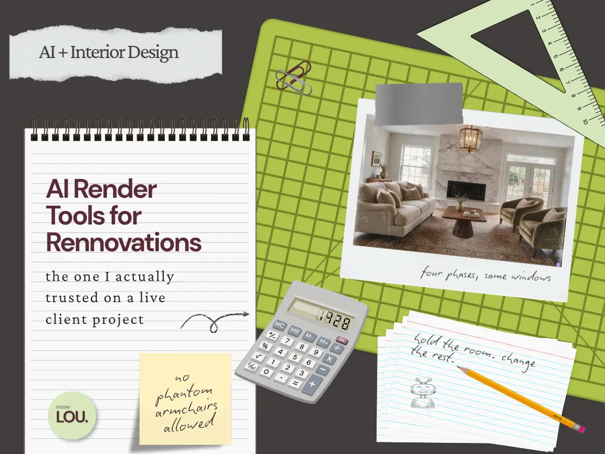
That gap is what sent me looking for a tool built the other way. I tested Roomagic on a live client project: a four-phase living room renovation, flooring and lighting first, then the fireplace, then the furniture plan, then styling. Across all four passes, it held the room's actual architecture instead of quietly redrawing it, and it didn't invent furniture nobody asked for. That combination is rarer than it should be, and the design report it generates alongside every render might be the more useful discovery of the two.
Why Most AI Render Tools Don't Survive a Real Renovation
Most tools I've tested treat every project as a blank site. Upload a photo, describe a style, and the tool treats the room as raw material rather than a fixed structure it needs to respect. That works fine for a mood board. It falls apart the moment a client is looking at their actual living room and expects to recognize it in every version you show them.
Two problems keep showing up. The first is invented furniture: an armchair nobody asked for, a plant in the corner that has nothing to do with the brief, a rug that changes pattern between rounds. The second is drifting architecture: window placement that shifts a few inches, a ceiling height that reads differently from one render to the next, a camera angle that quietly rotates so the before and after no longer line up. Neither is a style problem. Both are trust problems, because the entire value of a renovation render is that a client can hold it next to the room they're standing in and believe it.
Rigid style dropdowns make this worse, not better. A tool that only offers you a choice between preset looks has no way for you to say keep the fireplace where it is, or don't touch the window trim. Open-ended prompting solves half of that, since it lets a designer talk to the tool the way they'd talk to a contractor. But open-ended prompting only works if the tool actually listens to the parts of the prompt that matter, which is exactly where most of what I've tested breaks down. Ask for one change, get three.
This distinction matters more for a designer working an existing space than for someone scrolling for inspiration. A homeowner browsing ideas for a room they haven't touched yet can shrug off a render that drifts a little, since nothing about it is being measured against reality yet. A designer walking a client through phased changes to a room they already own doesn't get that grace. Every render is a promise about a specific ceiling, a specific window, a specific fireplace, and a client notices the moment something stops matching what's actually there.
It isn't a niche complaint either. A recent survey of nearly 800 architects and designers found that accuracy and reliability sit well ahead of cost among the practical reasons firms hold off on AI tools, alongside workflow integration and questions of creative authorship. Renovation work raises the stakes on all of it. A floor plan someone actually lives in is a far easier place to notice when a tool got it wrong than a fantasy room nobody's ever going to build.
Roomagic is the first tool I've tested where those two failure modes weren't a coin flip. That's worth walking through in some detail before getting to what might be the more useful part of the product.
The Control That Actually Makes This Useful for Designers
There's more than one reason to break a render into phases instead of asking for everything at once. Sometimes it's about the client, walking them through a sequence of decisions rather than dropping one overwhelming transformation on them. Sometimes it's about the work itself: you change the architecture, look at it, and realize you want to see the space furnished before committing to a flooring choice. Either way, I've found it helps to start by clearing the room, stripping out the existing furniture and clutter first, so the tool isn't negotiating with what's already there while you're asking it to change something else.
For this test, I ran four phases: flooring and lighting first, then the fireplace, then the furniture plan, then styling, each one building on the one before it. Across all four, the camera angle didn't drift, the windows stayed exactly where they started, and the room's proportions read the same in phase four as they did in phase one. That sounds like a low bar until you've watched a different tool quietly stretch a ceiling or nudge a window three inches to the left between renders, at which point a designer stops trusting anything the tool shows them.
The furniture side held up just as well. Of everything I've tested, Roomagic invented the fewest out-of-place objects, no phantom armchairs, no decorative plant nobody asked for, no rug that changes personality between rounds. When I asked for a change, I mostly got that change, not that change plus three others the tool decided I probably wanted too.
I could also describe what I actually wanted the way I'd brief a contractor, instead of choosing from a list of preset looks: keep the fireplace surround, swap the flooring to a wider white oak plank, don't touch the window trim. That kind of specificity is exactly what a rigid style menu can't hold, and it rewards the part of the job a designer is actually good at, translating a vague feeling into a precise instruction, instead of flattening it into a dropdown.
The tool also gives you real range to work with before you ever start typing. Interior and exterior projects are both supported, the room type list goes well beyond the basics, and the style options are specific enough to actually narrow down what you're picturing instead of leaving you to describe it from nothing.
Comparing a render back to reality is built into the interface itself, not something you have to do in your own files afterward. A before-and-after slider lets you drag across a finished render to see the original room underneath, and a click-to-reveal option does the same thing on the final render without the drag. For a category where the whole argument is trust, being able to hold both versions up against each other inside the tool is a small feature that earns its place.
One smaller thing worth naming: the tool didn't just preserve my original photo, it improved it. Base image quality came through noticeably cleaner in the output than in what I uploaded, which isn't the headline feature here but is a nice bit of margin when the render is also serving as a before-and-after comparison.
The baseline here is different from what I've come to expect from this category. Most AI render tools ask you to accept a certain amount of noise as the cost of speed, an odd chair here, a slightly warped window there, and just work around it. Roomagic is the first one where holding the room steady felt like the default behavior instead of something I had to fight for every round.
The Design Report Is the Real Differentiator
Every render came with a written report attached: a case summary, a design brief, a material brief, a budget snapshot, and a list of key changes from the previous phase. I wasn't expecting to see this at all in an AI rendering tool. It's genuinely unique from what I've seen, and it gives the render something tangible and usable beyond the image itself.
It's built for two people at once, and it actually works for both. A homeowner gets a plan they can act on without a designer standing next to them to translate it. A designer gets most of a client proposal already drafted: the reasoning, the material choices, a rough sense of budget, all organized before you've opened a blank document. I've tested plenty of tools that generate a nice image and stop there. None of them hand you the writeup that turns a render into something you can actually present.
That's the part I'd build marketing around if this were my product. The render quality is good, and the control is rare, but a lot of tools eventually catch up on image quality. Fewer of them are thinking about the deliverable a designer actually needs at the end of a client meeting, which is not just a picture but a document.
A few things would make it better. Right now the render exports and the report doesn't, so the most useful part of the output is stuck inside the app instead of dropping straight into a client presentation. I'd also love to see it written in first person, since it currently reads a little like generated copy rather than a designer's actual point of view. And linking out to the specific products named in the material list would turn it from a nice-to-have summary into something a homeowner could act on the same day. None of that changes what the report already does well. It just means there's an obvious next step for a feature that's already ahead of anything else I've tested.
Running Roomagic Through a Four-Phase Living Room Renovation
Getting the render itself right was rarely the hard part. What slowed the whole test down was the process around it.
When I gave the tool a new prompt after a render, it went back and edited my original uploaded photo instead of building on the render it had just produced. Every other AI render tool I've used treats the most recent output as the new base image, so this caught me off guard. To actually build a design in stages, I had to download each render and re-upload it as a fresh source image before moving to the next phase. Four phases meant four of those round trips, on top of four render waits that were running a little over two minutes each at the time.
The re-upload cycle cost more than time. Each download and re-upload puts an image through another round of compression, so by the fourth phase I was rendering against a visibly softer copy of the original photo, not the crisp source I started with. On a project where the whole point is comparing a final render back to the real room, that's not a small thing.
None of this showed up in the output itself, the control held across all four phases regardless. It showed up in how long the whole sequence took to actually finish, and in a nagging sense that I was fighting the tool's workflow more than its rendering. A test that should have felt exploratory, four passes on one room, plenty of room to try things, started to feel like a chore by phase three.
Figo, Roomagic's founder, had invited me to test the tool and give him honest feedback, so I wrote all of this up and sent it back to him afterward. What happened next is the part of this review I'm most excited to write about.
What Happens When You Send a Founder Real Feedback
He asked for the kind of feedback most founders say they want and don't actually get: specific, unfiltered, and covering more than just the two things that were bothering me most. I gave him all of it, the render speed, the editing workflow, and a handful of smaller notes on material accuracy, onboarding, and the explore page.
He didn't get defensive about any of it, and he didn't just say thanks and move on. He wrote back explaining why the speed was where it was, walked through what the tool is actually doing during a render to hold architecture and quality steady, and said plainly that the current speed wasn't good enough and had real room to improve. On the editing workflow, he called out that continuing from the latest render rather than the original photo wasn't a small feature request, it was something the early version of the product had simply not gotten to yet, and that it mattered more than he'd realized for how a designer actually works in phases.
Then he shipped. Render time went from a little over two minutes down to around 40 seconds. And viewing a completed render now shows a “Create Variation” option, so the next round builds on that result directly instead of requiring a download and a re-upload.
I went back and retested it myself, and both changes hold up. The renders are genuinely faster, and building on a previous result instead of re-uploading makes the whole process feel smoother in exactly the way it was slow before.
I've given feedback to plenty of companies over the years. Most of it disappears into a form. This is the first time I've watched a founder take a designer's workflow complaints seriously enough to rebuild around them within weeks, not quarters. That responsiveness is worth as much to me as anything the tool does on its own, because a tool that's already good and still listening is a different bet than one that's already good and finished.
Is Roomagic Worth Using?
Roomagic is the AI render tool I'd point another designer toward first if the job is renovating a room, not building one from scratch. It holds architecture steady, it doesn't invent furniture, and the design report alone is worth testing the tool for on its own. It isn't without rough edges. Material changes can still bleed onto surfaces you never named, and the open-ended prompting that makes this tool so capable also means a vaguer request gets you a vaguer result. None of that changes the verdict. Fewer edges than most of what I've tested, on the one thing that actually matters here, control, and a founder who's still actively closing the gaps that are left.
If you're weighing this against everything else out there, my full rundown of eight AI interior design tools is the wider landscape. And if you want a hand actually building an AI-informed virtual design process, not just picking a tool, that's the work I do. Get in touch here.
Be the first to know about every new letter.
No spam, unsubscribe anytime.