Clearwater Hills
At a glance
Scope: Full remodel + ~1,100 sq ft extension
Style: Modern take on Frank Lloyd Wright, modernist + organic
Palette: Warm woods, stone, natural materials, desert-referenced neutrals
The design point of view on this one was a modern read of Frank Lloyd Wright. Clean architectural lines, deep respect for site, and the organic-plus-modernist language Wright basically wrote into American residential design. That was already the aesthetic direction. The real work was making a full remodel plus an ~1,100 sq ft extension read as a single, coherent home rather than an original house with a new wing bolted onto the back, which is how most additions of this scale end up landing.
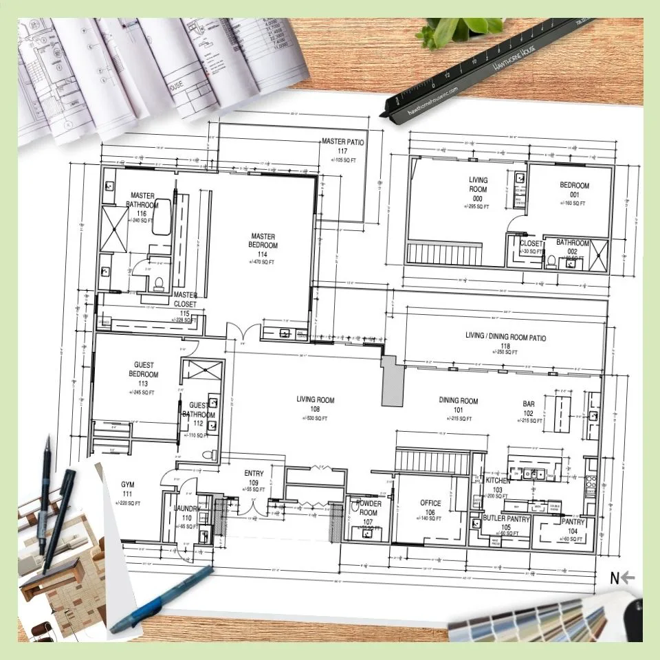
Layout was the primary problem to solve. The house needed to work significantly better than it did, which meant a full rearrangement of the plan around the existing living room as the anchor. I moved the front door to create a grander, more intentional entry sequence, and relocated the kitchen and dining to the right side of the home so the entertaining and living spaces sit together on one side and the more private rooms sit together on the other. From there, the extension gave me room to design the master suite around the views of Camelback and Mummy that the original layout had underused. Every major room in that part of the house now opens toward the landscape rather than treating it as background, which is what FLW would have done and what modernist desert homes are supposed to do.
The extension also had a family reason behind it. The homeowner's son was moving back home, and the guest suite in the new wing needed to function as a real, private space for him rather than a nominal spare bedroom, without the addition ever reading as a separate unit from the outside or inside. I designed the transition between the original footprint and the new wing so material palette, ceiling lines, and window rhythm carry through both. The suite reads as part of the house from the shared spaces, and as its own retreat once you're inside it.
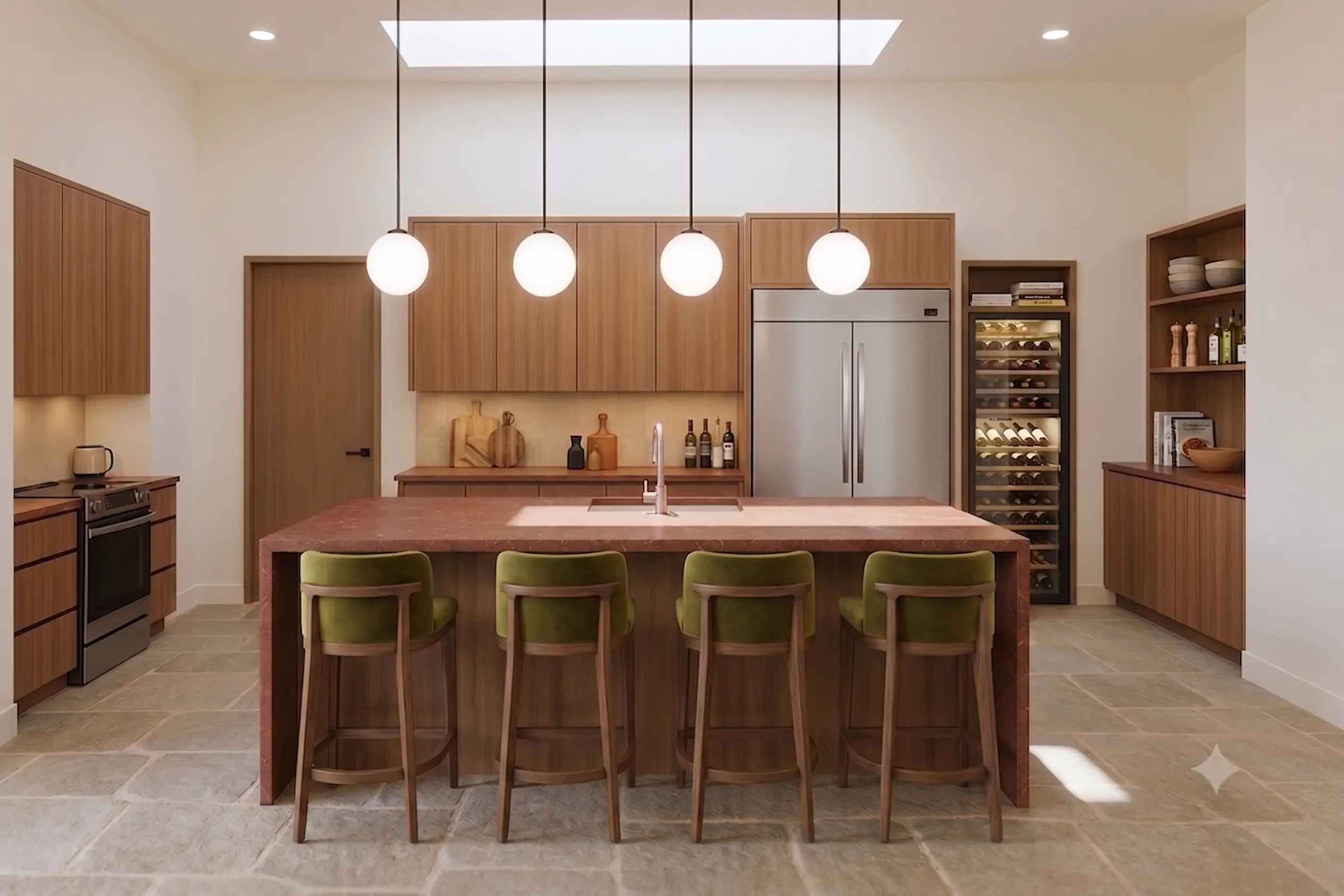
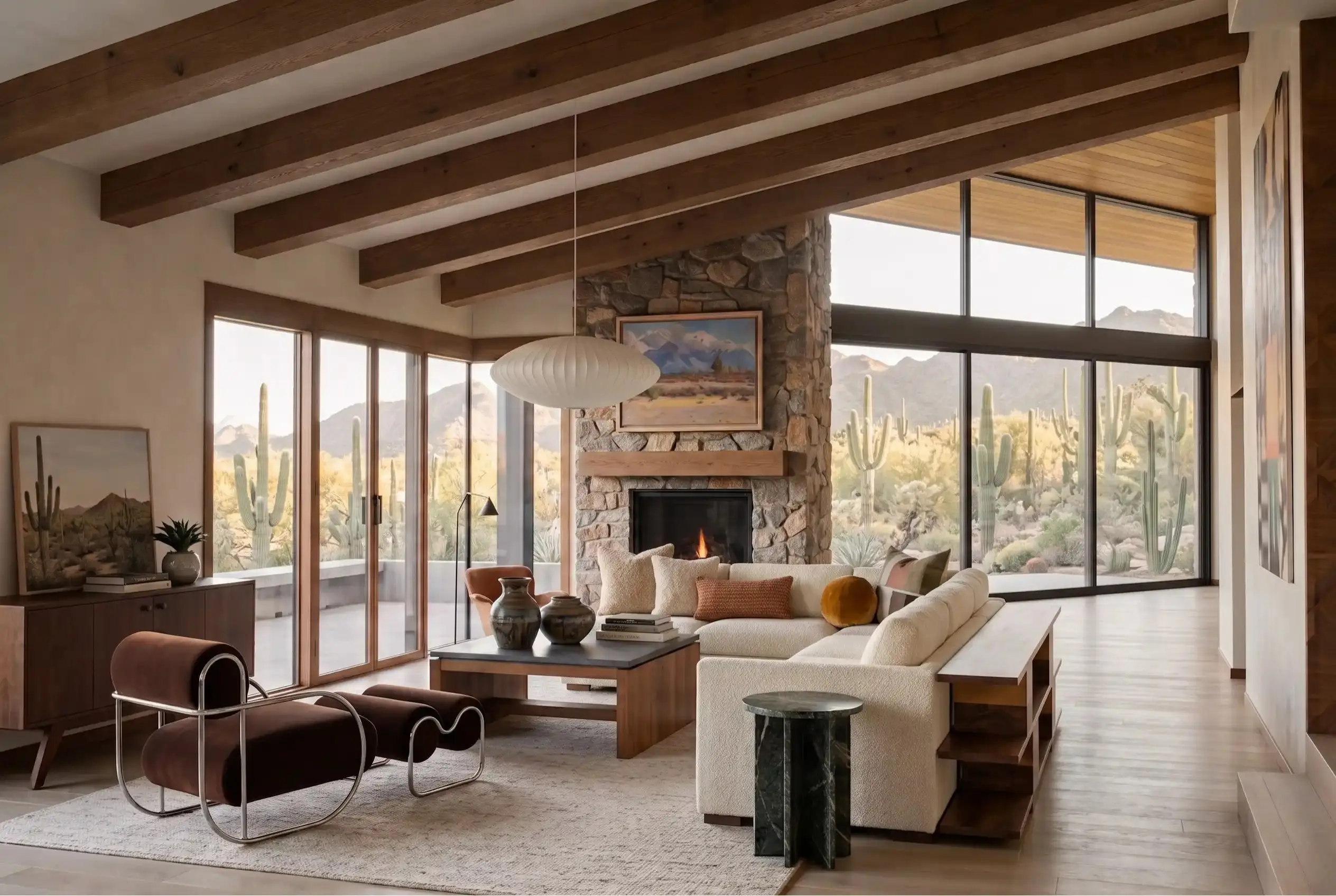
Material choices carried the FLW reference without imitating it. Warm natural woods, stone, and desert-referenced neutrals across the FF&E and finishes give the house its organic warmth, while the architectural lines and window strategy hold up the modernist half of the language. The result is a home that reads as elevated and functional in a way the original layout wasn't.
Clearwater Hills
At a glance
Scope: Full remodel + ~1,100 sq ft extension
Style: Modern take on Frank Lloyd Wright, modernist + organic
Palette: Warm woods, stone, natural materials, desert-referenced neutrals
The design point of view on this one was a modern read of Frank Lloyd Wright. Clean architectural lines, deep respect for site, and the organic-plus-modernist language Wright basically wrote into American residential design. That was already the aesthetic direction. The real work was making a full remodel plus an ~1,100 sq ft extension read as a single, coherent home rather than an original house with a new wing bolted onto the back, which is how most additions of this scale end up landing.
Layout was the primary problem to solve. The house needed to work significantly better than it did, which meant a full rearrangement of the plan around the existing living room as the anchor. I moved the front door to create a grander, more intentional entry sequence, and relocated the kitchen and dining to the right side of the home so the entertaining and living spaces sit together on one side and the more private rooms sit together on the other. From there, the extension gave me room to design the master suite around the views of Camelback and Mummy that the original layout had underused. Every major room in that part of the house now opens toward the landscape rather than treating it as background, which is what FLW would have done and what modernist desert homes are supposed to do.
The extension also had a family reason behind it. The homeowner's son was moving back home, and the guest suite in the new wing needed to function as a real, private space for him rather than a nominal spare bedroom, without the addition ever reading as a separate unit from the outside or inside. I designed the transition between the original footprint and the new wing so material palette, ceiling lines, and window rhythm carry through both. The suite reads as part of the house from the shared spaces, and as its own retreat once you're inside it.
Material choices carried the FLW reference without imitating it. Warm natural woods, stone, and desert-referenced neutrals across the FF&E and finishes give the house its organic warmth, while the architectural lines and window strategy hold up the modernist half of the language. The result is a home that reads as elevated and functional in a way the original layout wasn't.